This one uses Rockwell Font with a subtle texture. It feels louder, more motivational. The texture helps to give it a more interesting feel with a hint of hard work.

This is the same font, Rockwell, but without the texture. It is slightly less engaging and doesn’t hold as much interest.

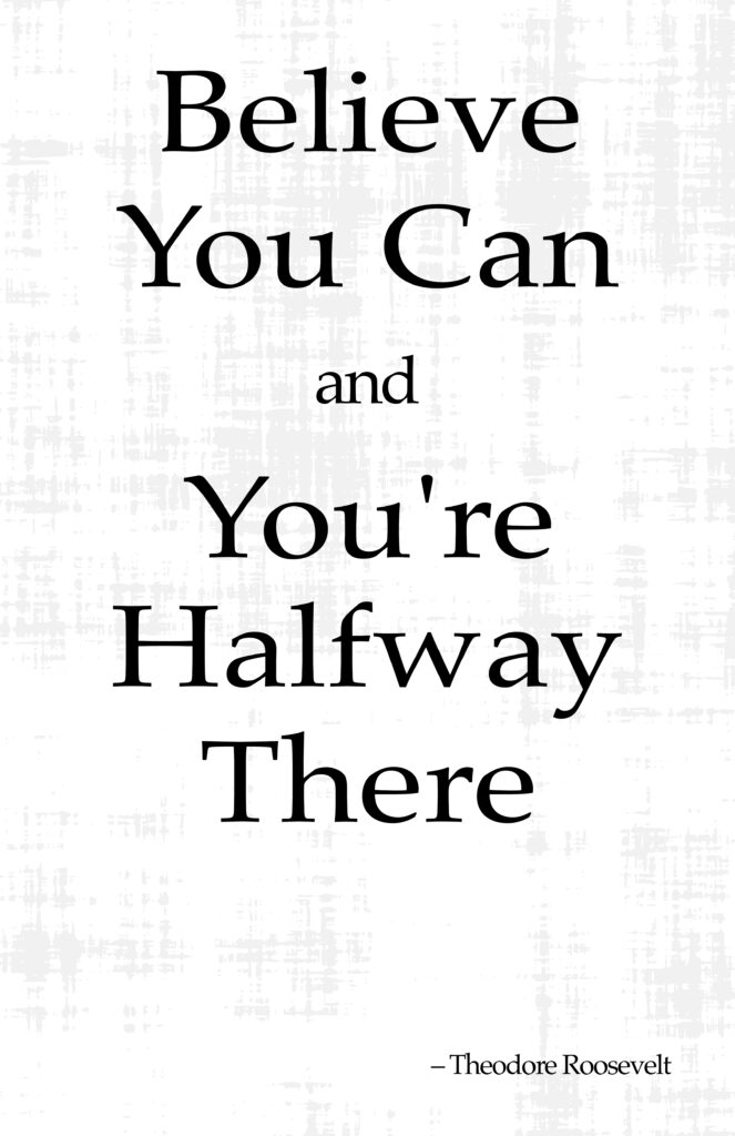
This one is in Palatino font and is more inspirational, but the grunge texture obscures the message a bit, creating a conflict between elegance and inspiration due to the worn, weathered look. It seems out of place.

This one, Palatino with a clean background, is for a more elegant message. Perhaps a study or something where reflective consideration is the goal.


